Visma | Visionplanner
User Experience design & Designsystems
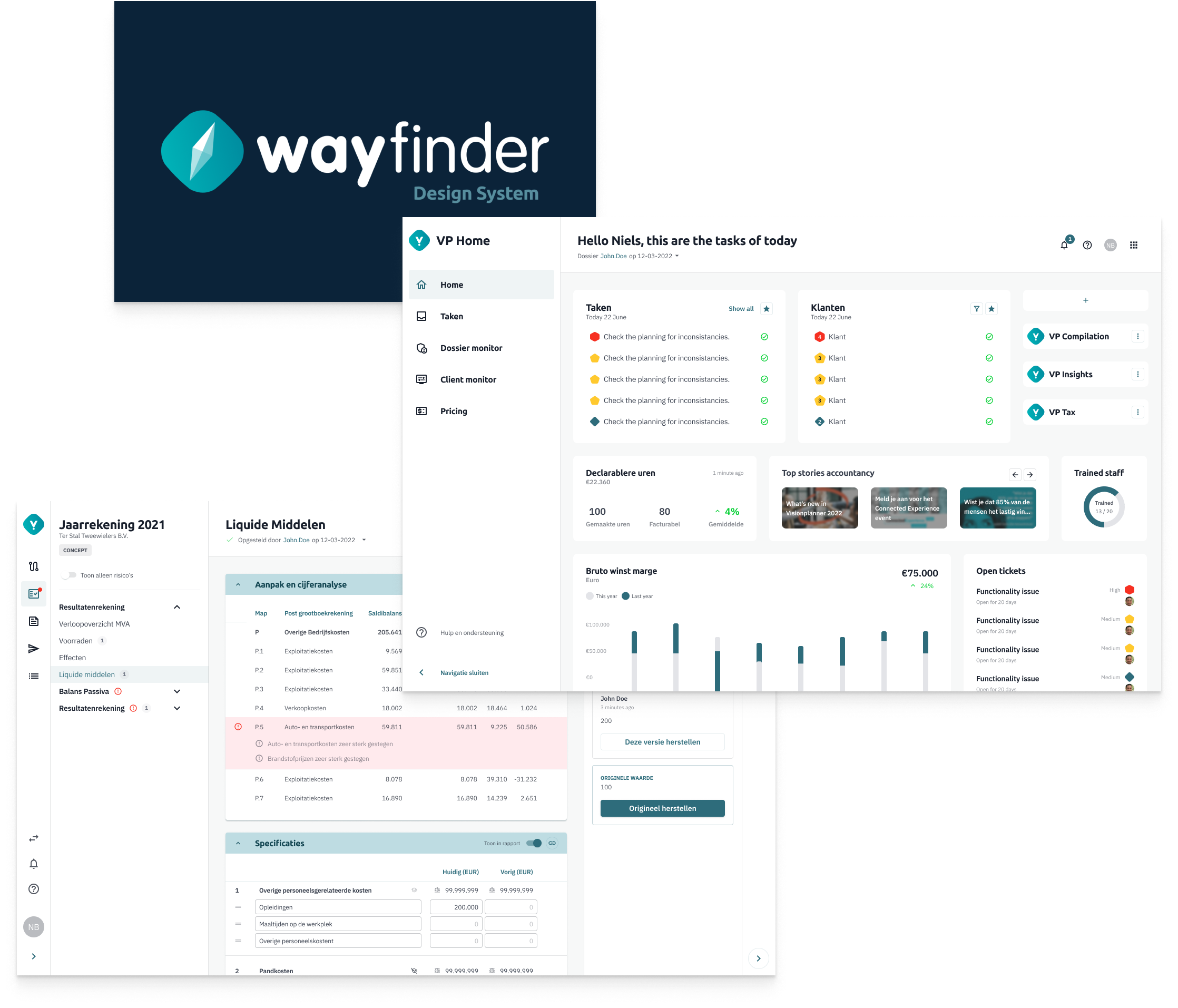
Wayfinder
During my time at Visionplanner, I contributed to the implementation and development of Wayfinder, a comprehensive design system. Visionplanner operates in the accountancy sector, focusing on providing essential yearly documentation for clients.
The primary goal of the Wayfinder designsystem was to streamline processes and strengthen our trust within the accountancy industry. One of the key challenges we addressed was the lack of consistency across the styles used in our product range, which impacted the user experience and trust.
To improve user confidence and create a more cohesive experience, we worked on consolidating these varied styles into a unified design system. The Wayfinder design system became the central solution, ensuring alignment across Visionplanner’s product portfolio. As part of this initiative, we also began transitioning towards a platform-as-a-service (PaaS) model to support our evolving product strategy.
Establishing Brand Consistency: Colors and Basics
Our journey began with a collaborative effort between our team and the marketing department to establish a cohesive style guide. This involved aligning the brand identity with the product's visual elements to ensure consistency across applications, websites, and customer interactions.
Ultimately, our aim was twofold: to instill trust among our users and to demonstrate our commitment to incorporating their perspectives into our design decisions.

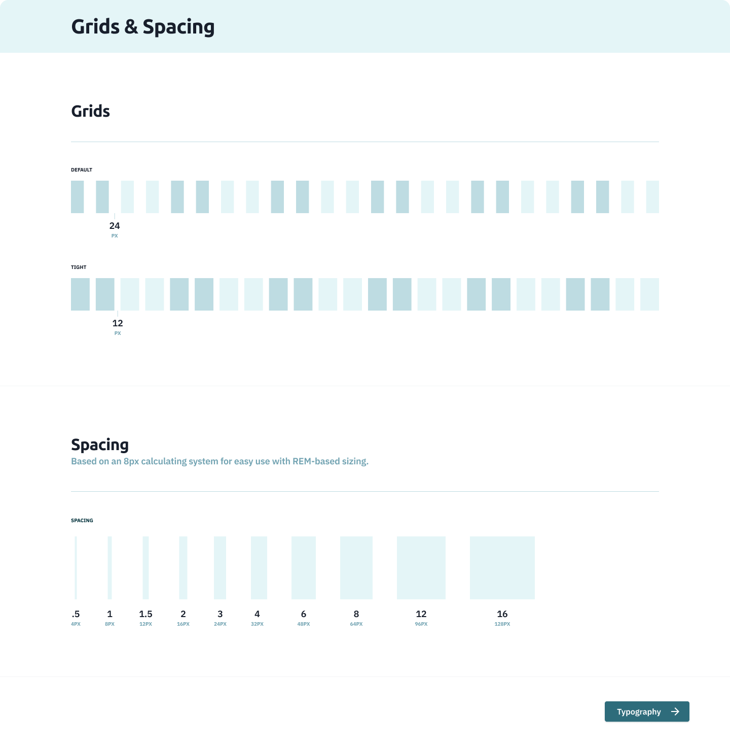
Optimizing Layouts: Grids & Spacing
Achieving consistent spacing was a priority, and to accomplish this, we implemented a systematic approach.
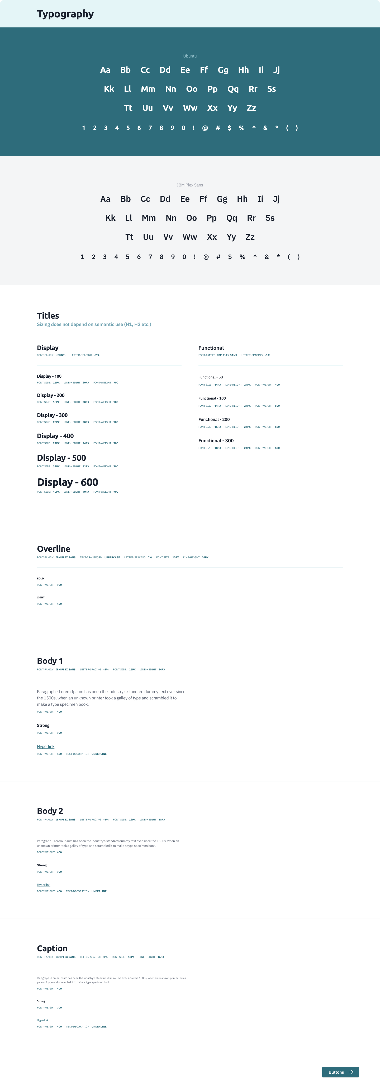
Crafting Consistent Typography with Figma Styles
We defined styles and semantic variables for each font and context in which it was used. This provided designers with clear guidelines for selecting the appropriate font and style from our cohesive design system.
Furthermore, by utilizing the same fonts across both marketing and product design endeavors, we ensured alignment between graphic design elements and product interfaces.

Streamlining Iconography
Upon joining the company as product designers, we observed that product owners were primarily responsible for creating icons. Recognizing an opportunity to enhance their workflow and promote best practices, we provided them with a standardized example of icon creation.
As our design system matured, we opted to integrate Material Design icons into our designsystem. This decision stemmed from the realization that many of the icons we required were similar in nature.
Atomic design
Atoms
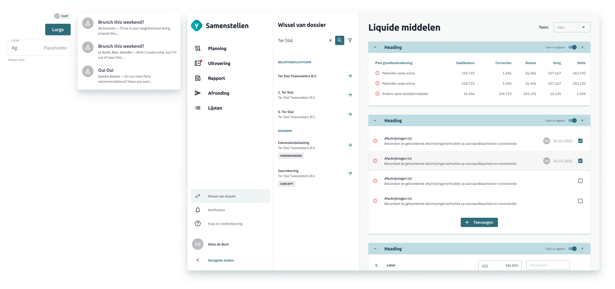
Atoms are the basic building blocks of UI design. These are the smallest, indivisible elements such as buttons, input fields, labels, icons, etc.
Molecules
Molecules are combinations of atoms that work together as a single unit. For example, a search bar (composed of an input field and a button) or a navigation menu (composed of menu items).
Organisms
Organisms are groups of molecules functioning together to form a more complex component that serves a specific purpose within a UI. Examples include a header (composed of a logo, navigation, and search bar) or a sidebar (composed of various widgets).
Templates
Templates represent the layout or structure of a page or section of a UI. They define the arrangement and composition of organisms and molecules within a specific context.
Pages
Pages are instances of templates filled with actual content. They represent the final stage where all the components are combined to create a fully functional UI.
By breaking down UI design into these smaller, more manageable components, atomic design promotes modularity, reusability, and scalability. It also facilitates collaboration among designers and developers since components are standardized and can be easily shared and reused across projects. Additionally, it encourages consistency and maintainability by enforcing a structured approach to UI design.
Visionplanner Compilation
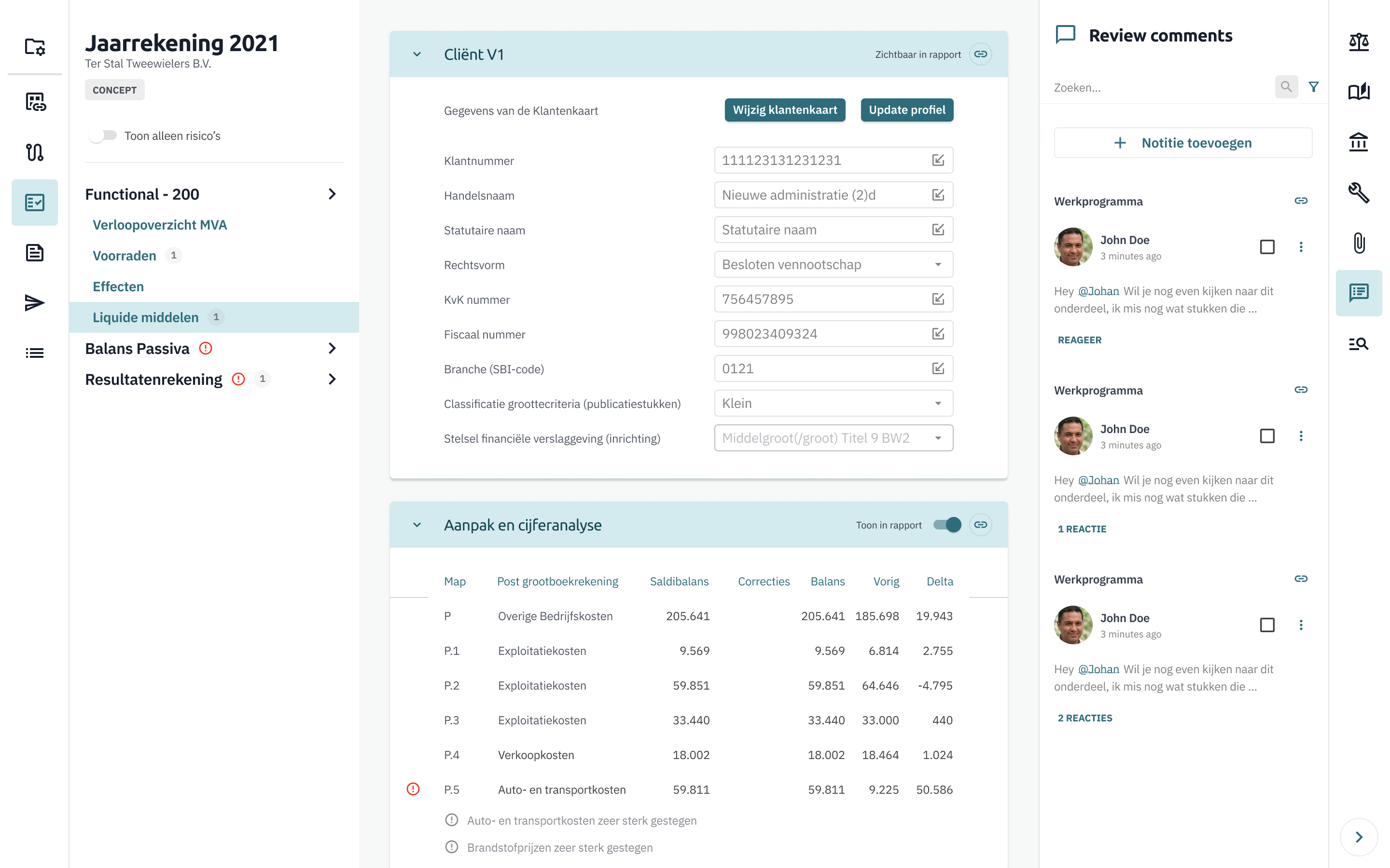
Visionplanner Compilation
With a clearly defined UI kit in place, called Wayfinder, we began developing Visionplanner Compilation a new application designed to support accountants in their daily tasks. The application streamlines workflows by integrating helpful information and automation into their routine processes.
During this time, we also focused on evolving Wayfinder from a simple UI kit into a fully-fledged design system. This involved defining reusable patterns and incorporating accessibility guidelines to ensure a more robust and inclusive design framework.